This suite will forever hold my heart as it was done for my bestie, Ivana, and her Match, Ryan.
Ryan, you see, is very lucky guy to have found this strikingly beautiful (and very tall) woman who will want nothing but to spoil him rotten. For a girl who listened to the Food Network as background noise, and who I practically begged to send in an application to Top Chef/Gordon Ramsey, Ryan has effectively ended his days as a misfed bachelor. I’m sure there’ll always be a decent home cooked meal paired with the perfect wine or beer if he just asks nicely! And don’t worry about him mismatching or updating his wardrobe, she will have that covered too.
I’ve known Czech-import Ivana for more than 20 years (I actually knew her before I met her but that’s a long, off point story). She is a classic beauty, with an eye for clean lines, no mess and impeccable style. I should not have been shocked by her mostly single-color sweater collection although later it made complete sense. It’s uncomplicated just like she is. From family vacations, weekday and weekend exploits, and to helping me to experience college life after I graduated from college, she is a forever friend, and I too, am so lucky to have found her and have her as my bestie.
So, when I heard they were getting married and wanted us to design their invitations, I was over the moon for her, but then overly anxious. How could I ever design something that was true to someone who means so much to me? There are so many things I can think of in the 20 something years we’ve put away together. So many memories, but I had to focus on theirs together not mine.
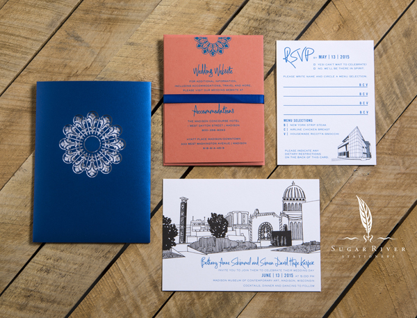
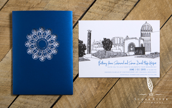
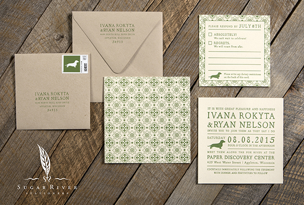
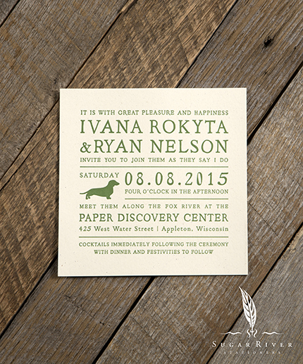
Getting down to creating their stationery suite wasn’t very easy. I wanted to include all sorts of tie ins to their wedding day from the tactile feel of the invite itself, to the message we wished to convey. Of the concepts we developed, this one was the one I felt strongest to. Their chosen venue, Appleton’s historic, Paper Discovery Museum, perched along the banks of the Fox River, pointed us to the Old World-master printing method of letterpress paired with gritty and seemingly imperfect papers. Those picks proved to be an excellent pairing to the solid green ink used throughout the suite. It was subdued, but bold at the same time. A classic look.
For design, we wanted a format that was different. We don’t do square invites very often and I felt that using a square was different and might help to show off a fully justified layout – framed by clean lines and white space. We incorporated old book style, elegant serif typeface for a lighter look and feel (Ivana is an avid book reader, so it made a good connection too). We also included a silhouette of a dachshund as a memento of Ivana’s puppy, Zoe, who was Ivana’s faithful sidekick for 16½ years. Zoe was in the design process all along, barking at me to close the file so she could have Ivana all to herself (whenever I called Ivana, Zoe would undoubtedly start barking until we hung up).
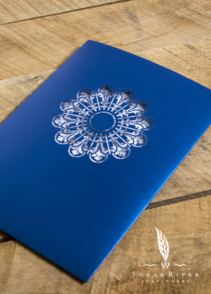
To provide flexibility in the suite, we introduced a pattern on a couple of elements including the back of the invitation. Since Ivana and Ryan planned their honeymoon for Barcelona, the pattern we used is a pull from an artifact of Andalusian tile.
Privy to their wedding day, the I Dos came off without a hitch in 4 minutes and 36 seconds. Aud got it on tape. Great food, great wine, great venue along the river. A happy couple and a so very happy for them friend! Ahoj!